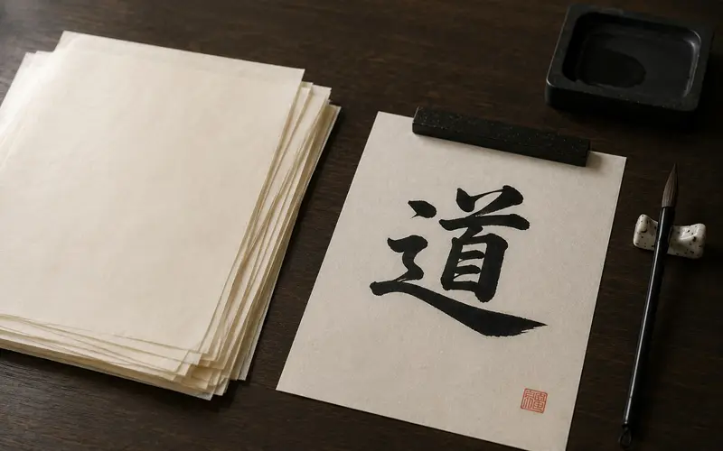
Brush the same character with the same brush and the same ink on two different sheets of paper, and you get two different characters. On slick printer paper, the ink sits on top and the stroke looks flat and a little dead. On a good sheet of washi, the paper drinks the ink, the edges soften, and the dry end of the stroke breaks into fine white threads. Nothing about your hand changed. The paper did half the work.
That is why calligraphers talk about paper as much as about brushes. This guide is about washi, the Japanese paper tradition, from the point of view of the person holding the brush: what it is made of, what it does to ink, which sheet to use for what, and how to get the most out of it.
What washi is
和紙 (washi) simply means “Japanese paper”: wa for Japan, shi for paper. It is set against 洋紙 (yōshi), the Western wood-pulp paper that now fills the world. The difference is in the fibre.
Ordinary paper is made from wood pulp: short fibres, chemically broken down, often carrying the acids that make a cheap paperback yellow and crack. Washi is made from the long inner-bark fibres of shrubs, and each of the three classic fibres behaves differently under a brush:
| Fibre | What it is like | Under the brush |
|---|---|---|
| 楮 (kōzo, paper mulberry) | Long, tough fibres; the most common washi | Strong and absorbent; ink spreads readily, good for bold strokes |
| 三椏 (mitsumata) | Finer and softer, with a slight sheen | Smoother surface; lines stay crisper |
| 雁皮 (gampi) | Very fine, lustrous, faintly translucent | Glassy and smooth; ideal for the thin, quick lines of kana |
Those long fibres are the secret of washi: they make it thin and strong at the same time, and they are what give ink somewhere to go.
How a sheet is made
The traditional process is slow and almost entirely by hand. Branches are steamed so the bark strips off, the dark outer bark is scraped away, and the inner bark is boiled, rinsed, picked clean by hand and beaten into a soft mass of fibre.
Then comes the step that defines washi. The fibres are stirred into a vat of water thickened with neri, a slippery mucilage from the root of the tororo-aoi plant, which keeps them evenly suspended. The papermaker dips a bamboo screen into the vat and rocks it, back and forth and side to side, so the fibres settle in crossing directions, layer upon layer. This technique, nagashi-zuki, gives washi its woven, mat-like strength. The wet sheets are pressed and dried on boards or heated steel.

What the paper does to your ink
Two effects matter most, and both have names.
- にじみ (nijimi), the bleed. A wet, slow stroke soaks into the fibres and spreads into a soft halo around the line. Controlled, it gives a stroke depth and a sense of moisture. Uncontrolled, it turns a character into a blot.
- かすれ (kasure), the dry-brush streak. A fast stroke with a brush running low on ink skips across the fibres and leaves white threads inside the black. It shows speed and energy, and it is something you plan, not an accident.
How much of each you get depends on three things you can control:
- The fibre. Kōzo papers spread ink more; smooth gampi papers keep lines sharp.
- Sizing. Some papers are treated with 礬水 (dōsa), a wash of animal glue and alum that stops ink from spreading. Painters and some kana calligraphers use sized paper. Most practice paper is lightly sized or not at all, so it lets the ink move a little.
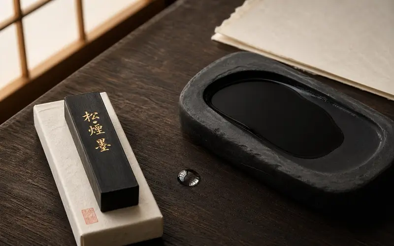
- Your ink. Thin, watery ink bleeds far more than thick ink. Bottled ink straight from the bottle behaves differently from ink you have ground yourself on an inkstone, where you choose the thickness. (More on that in what sumi ink is.)
A calligrapher reads a sheet of paper the way a painter reads a canvas. The same character, written in the five classical styles, wants different paper: a crisp block-style character likes a smoother sheet; a flowing cursive one comes alive on a sheet that lets the ink run.
Hanshi, gasenshi, and kana paper
Three kinds of sheet cover almost everything you will see in Japanese calligraphy.
半紙 (hanshi) is the practice sheet, about 24 × 33 cm. Every Japanese schoolchild learns on it, and serious calligraphers go through it by the stack. Most hanshi sold today is machine-made, often with wood pulp blended in, which is fine for practice; hand-made hanshi costs more and takes ink more beautifully. For the details, see what hanshi paper is, and for specific sheets worth buying, the practice paper guide.
画仙紙 (gasenshi) is the paper for finished works. It descends from Chinese xuan paper and comes in large standard sizes: 全紙 (zenshi, about 70 × 136 cm) and the tall, narrow 半切 (hansetsu, about 35 × 136 cm), the classic format for a hanging scroll. In Japan it is made especially in Kōshū (Yamanashi) and Inshū (Tottori). Gasenshi is usually more absorbent than hanshi, so the same ink spreads further; many calligraphers keep good gasenshi for years before using it, believing it takes ink better with age.
Kana paper is thin and smooth, often made with gampi, for the fast, fine lines of the native kana script. The court calligraphers of the Heian period wrote their poems on decorated papers, dyed, flecked with gold or mica, or patched from several colours. Some of the most beautiful objects in Japanese art are poems written on such sheets.
Getting the most out of a sheet
A few habits make a bigger difference than an expensive brush.
- Write on the smooth side. Feel both faces of the sheet. The smoother one is the front (omote). The rough back makes strokes fuzzy.
- Put a felt mat underneath. A 下敷き (shitajiki), a felt underlay, absorbs ink that passes through and gives the brush a slight cushion. Without one, ink pools and sticks to the table. (Choices are in the felt mat and paperweight guide.)
- Fold guide creases, if you need them. Beginners often fold hanshi lightly into a grid to place characters evenly: in half for two characters, in thirds or quarters for more. Unfold it flat before writing.
- Test a new paper first. On a scrap, brush one slow, wet stroke and one fast, dry stroke. In ten seconds you will know how much that paper bleeds and how easily it breaks into kasure.
- Match ink to paper. If the ink spreads too much, thicken it (grind longer, or use less water). If the brush drags, thin it slightly.
Why washi lasts a thousand years
Long fibres, cross-layered forming and the absence of acid add up to paper that lasts on a scale Western paper cannot touch. Paper documents from the 8th century still survive in the Shōsōin repository at Nara. This is also why conservators at major Western museums use thin Japanese tissue to mend torn prints and drawings: it is nearly invisible over a tear, strong enough to hold, and stable for centuries.
In 2014, UNESCO added washi, the craftsmanship of traditional Japanese hand-made paper, to its Intangible Cultural Heritage list, through three communities that still make it the old way: Sekishū-banshi in Shimane, Hon-minoshi in Gifu, and Hosokawa-shi in Saitama. Echizen in Fukui and Tosa in Kōchi are other famous paper towns. These are working places, not museums.
For a calligrapher, that durability has a quieter meaning. A character brushed on good paper with good sumi ink does not fade the way printed ink does. What you write today can outlast you.
What washi is not
It is not just paper with a nice texture. The fibre is different: long plant bark, not pulped wood. That is a difference of material, not of finish.
It is not fragile because it is thin. Even tissue-thin washi is remarkably tough, because the fibres cross and lock.
It is not one kind of paper. “Washi” covers sheets that drink ink greedily and sheets that barely let it spread. Choosing among them is part of the craft.
It is not wasteful. The kōzo shrub is cut back and regrows from the same root each year. The ethic around it runs the other way too: paper was precious, and the idea of mottainai meant a calligrapher’s scraps were used to the last corner.
Where to go next
- The practice sheet — what hanshi paper is and the practice paper guide.
- What goes under it — the felt mat and paperweight guide.
- What goes on it — sumi ink, stick vs bottle, and how to grind ink on an inkstone.
- Where to start — the complete beginner’s guide to Japanese calligraphy.
- Other things made from it — origami, and ukiyo-e, the woodblock prints pulled on washi.
Washi is made of shrub bark, river water and the rocking of two wrists. For most people it is a beautiful material. For anyone with a brush in hand, it is half of the instrument. The next time a stroke blooms softly at its edge or breaks into white streaks at its tail, remember that the paper is answering you.